When I started working at Zendala, the startup was already offering a yearly Blood Chemistry test to its users when hiring a paid insurance plan. The agreement was made with Salud Digna, a network of laboratories throughout Mexico that offer a wide variety of medical tests at low cost. The test was available to the user after their first six months of being insured.
The project
My team and I were asked to design the whole process, which had to include:
1. Users finding out about the available test
2. Users getting the information they needed to get the test done
3. User getting their results.
The team working on the project was composed of:
- Diego Cabrera, a Service Designer
- Karen Loga, a UX researcher
- Me, as a UX/UI Designer
We also collaborated with two physicians for all medical aspects.
For this project, Diego Muradás, our CEO, was our main stakeholder.
Our assumptions were:
- Most people want to know their health status but don’t know where to start or what to do.
- By providing customers with an easy way to find out their health status, our insurance would have an advantage over the competition.
- People want to understand their health without having to go to the doctor
Research
We started our research by targeting two groups of people: People who were already insured by Zendala, and people who had been looking for insurance but had yet to hire an insurance company.
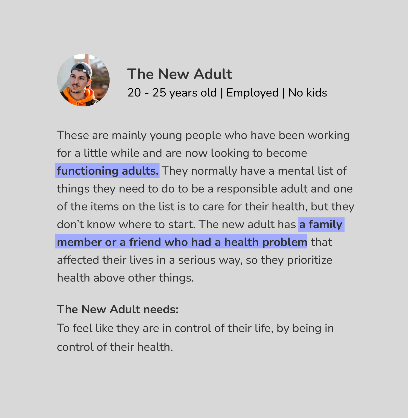
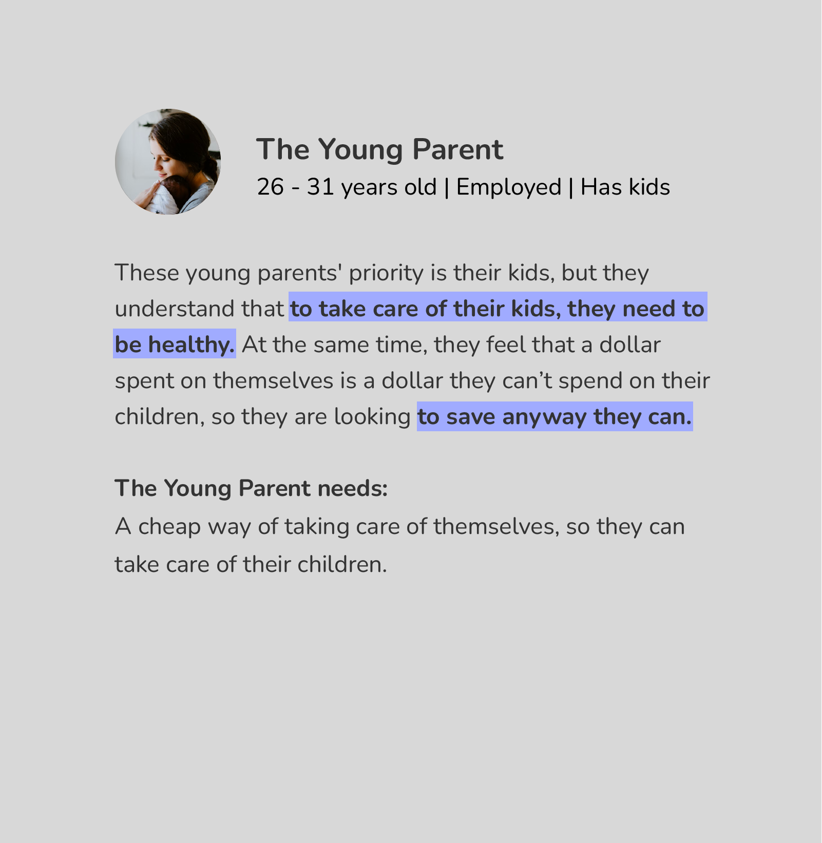
We were able to detect three different users.

The solution
We realized that only providing a lab test and delivering a pdf with the results was not enough.
We teamed up with two doctors who helped us create a document to feed our app’s intelligence. The document was a detailed analysis of all the indicators of the blood test: low levels, acceptable levels, high levels, interpretation of each indicator, and recommendations for each result. Thanks to this document, the user will be able to understand the general state of their health and take action if necessary.
Zendala also offers an online medical consultation service called Dr. Zenda. When giving the result to the patient, we included a link to Dr. Zenda so they can review their results with a general practitioner at that very moment.
Lessons learned
We tested the prototype with real users and got great feedback that helped us improve the product. Some of the things we learned were:
Language is important
We tested different health statuses for the summary, some words were deemed too harsh and some seemed to cause confusion. Our users helped us find the right words and were quite pleased with the result.
Prioritize when giving important information
In our first design of the interpretation tab, we didn't use color coding for the numbers. The feedback we got was that the point of this tab was a bit confusing at first glance. We came up with color coding and arranged the results so abnormal indicators were at the top of the list. The change got very positive feedback.
Teamwork works
Even though every member of the team had different roles, we were all involved in every part of the project. The result would not have been the same if only one person worked on this.
The final version of this feature is still being developed so it's not available to the general public yet. But keep an eye out for any updates from Zendala, we're always improving!
