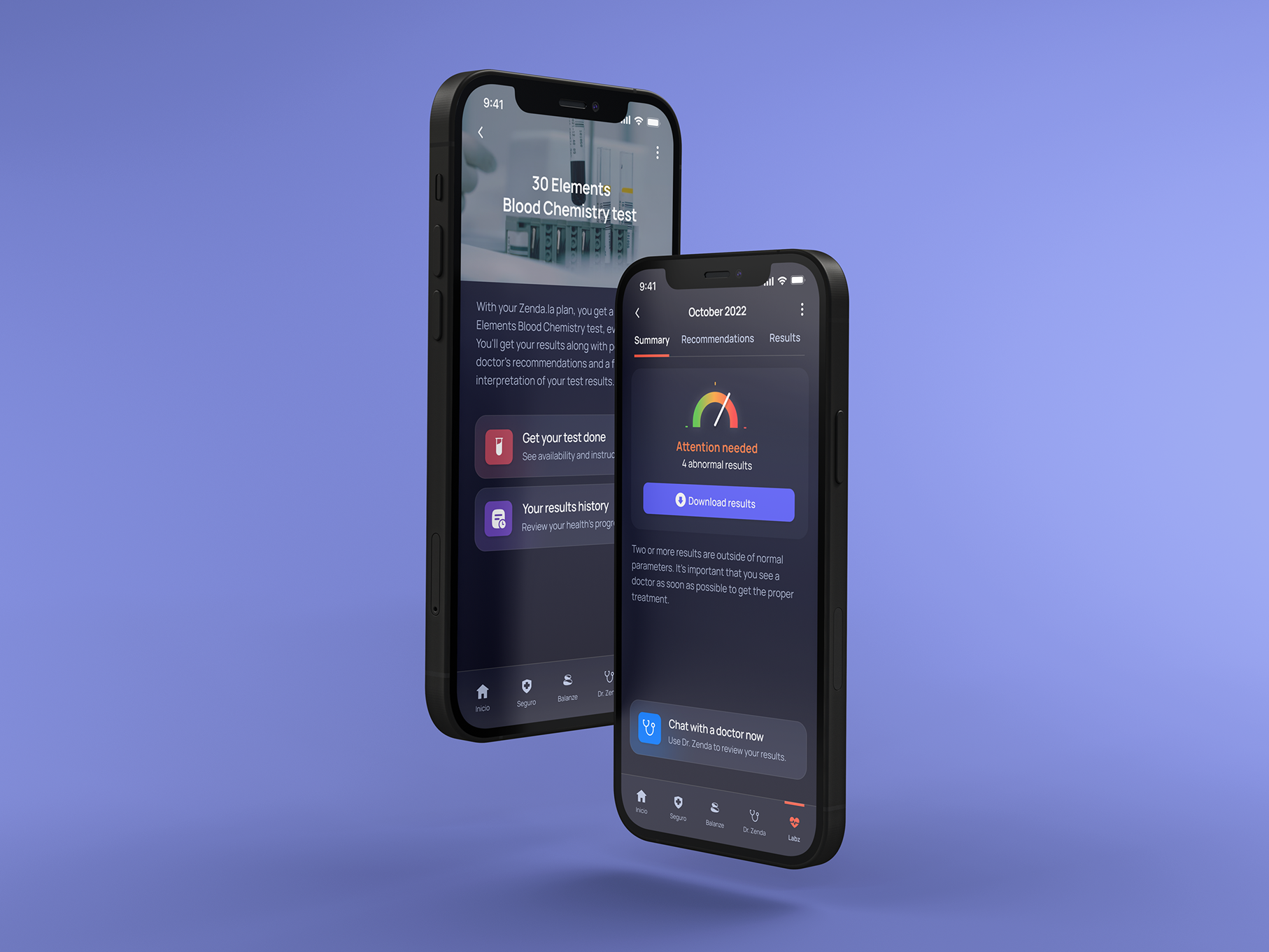
I worked at Zendala for over a year: During that time I created several products, one of which was their website. Zendala is an insuretech that offers a personalized "health plan" that can include insurance (in case of accidents, critical illnesses, broken bones, hospitalization, and surgeries), online medical consultations, a step tracker, and yearly medical check-ups: all that you need to stay healthy and stress-free.
Team and project
We knew there was a need to redesign the website because the bounce rate was really high.
The people working on this project were Monica De Salazar (Growth leader), Diego Cabrera (Service Designer), and me (Product Designer).
For this project, our stakeholder was the CEO of Zendala: Diego Muradás. All progress done on the website had to be shared with him.
Research
To develop the website, my team and I did a round of interviews and we discovered three main things:
One: People don't trust insurance companies: there's a feeling that they are boring, dishonest, and looking to take advantage of you.
Two: While people over 50 are still skeptical of startups, young adults are trusting startups more and more. Many of them are looking at new startups to solve their daily problems, and insuretechs are rising.
Three: After the Covid-19 pandemic, wellness became a top priority. People are now looking at what they do and what else they could be doing to improve their health.
Branding
We used bright colors to get rid of the idea that health is something boring and somber. Zendala is a fun, easy-to-use solution targeted toward young adults that are trying to be more independent and responsible.
Two characters were created and used though-out the website – these characters tested well with clients, who found them likable and memorable.
Two characters were created and used though-out the website – these characters tested well with clients, who found them likable and memorable.
To explain what can be achieved with Zendala, each solution was explained separately: prevention, medical consultations, and insurance. When you first enter the website you can see a summary of each solution.
From there you can learn more on each solution's page.
Price calculator
The most important part of the website was explaining the different plans Zenda.la offers, as the price and coverage depends on the age of the user. I incorporated a calculator so people could exactly how much their plan would cost.
Coverage
Another challenge was to explain what each coverage meant and what was included. Unlike other insurance companies, Zenda.la aims to be 100% transparent with their clients: no fine print, what you hire is what youo get.
So for something as boring as terms and conditions, it was a challenge to make the information appealing.
For this, I used "Corazona", the illustrated heart, to create a submenu that users could navigate. As mentioned before, during our research, one of the main things people remember and liked about Zenda.la, was the use of charismatic characters in our communication.
For this, I used "Corazona", the illustrated heart, to create a submenu that users could navigate. As mentioned before, during our research, one of the main things people remember and liked about Zenda.la, was the use of charismatic characters in our communication.
